As Heritage Foundation researchers have demonstrated throughout the coronavirus pandemic, the spread of COVID-19 in the U.S. has been heavily concentrated in a small number of states—and among a small number of counties within those states.
As our research has pointed out, state-level figures do not adequately describe the concentrated nature of the spread of COVID-19.
>>> What’s the best way for America to reopen and return to business? The National Coronavirus Recovery Commission, a project of The Heritage Foundation, assembled America’s top thinkers to figure that out. So far, it has made more than 260 recommendations. Learn more here.
Moreover, even though the U.S. saw a rapid rise in cases during the summer, the overall levels of concentration have remained fairly consistent.
For instance, as of Sept. 15, the 30 counties with the most COVID-19 deaths accounted for 26% of all the cases in the U.S. and 40% of all deaths, much greater than those counties’ share of the population (18.4%). That is, just 1% of the counties in the U.S., representing just over 18% of the population, are responsible for almost half of the country’s COVID-19 deaths.
The Heritage Foundation’s newest interactive graphic allows individuals to see more detail on these concentrations among the counties with the most deaths as well as those with the fewest.
For instance, the graphic allows users to select data from the five counties with the most deaths, all the way up to the 50 counties with the most deaths. It also allows visitors to select data from counties with no deaths, all the way up to counties with 10 or fewer.
Once a category is selected, the graphic provides the percentage of counties represented by that category, the percentage of the population contained in those counties, and the percentage of all U.S. COVID-19 deaths in those counties.
For example, as of Sept. 15, 60.6% of all counties are reporting 10 or fewer deaths. These counties represent 13.1% of the population, and account for only 2.7% of total COVID-19 deaths in the U.S.
In contrast, the five counties with the most COVID-19 deaths represent just 0.2% of all counties, but they account for 16% of all COVID-19 deaths in the U.S., nearly three times their population share of 6.5%.
A list of the 50 counties with the most deaths is also provided, and that list has not changed very much since April. New York, for instance, recorded 32,745 deaths as of Sept. 15.
In fact, New York City has exerted an outsized influence on the national COVID-19-related death rate. Removing New York City’s deaths moves the U.S. from eighth place in the world in deaths per million to 13th place.
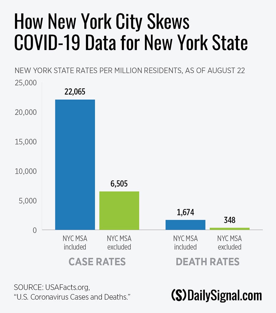
The New York City metropolitan statistical area even has an outsized influence on the overall statistics for the state of New York.

Removing counties in the New York City metropolitan statistical area from the state’s totals drops the death rate for New York state to 348 per million, nearly 80% lower than the state’s rate when the New York City metropolitan statistical area is included (1,674).
That’s well below the national average and would move New York state from second place to 23rd place in deaths per million.
The same exercise with COVID-19 cases in the New York City area has a similar effect on the state’s totals.
Specifically, when withholding the New York City metropolitan statistical area cases, the overall case rate for New York state plummets by 71% (from 22,065 to 6,505), a level that is well below the national average.
Removing the New York City metropolitan statistical area moves the state of New York from sixth in case rate among U.S. states to 42nd place.
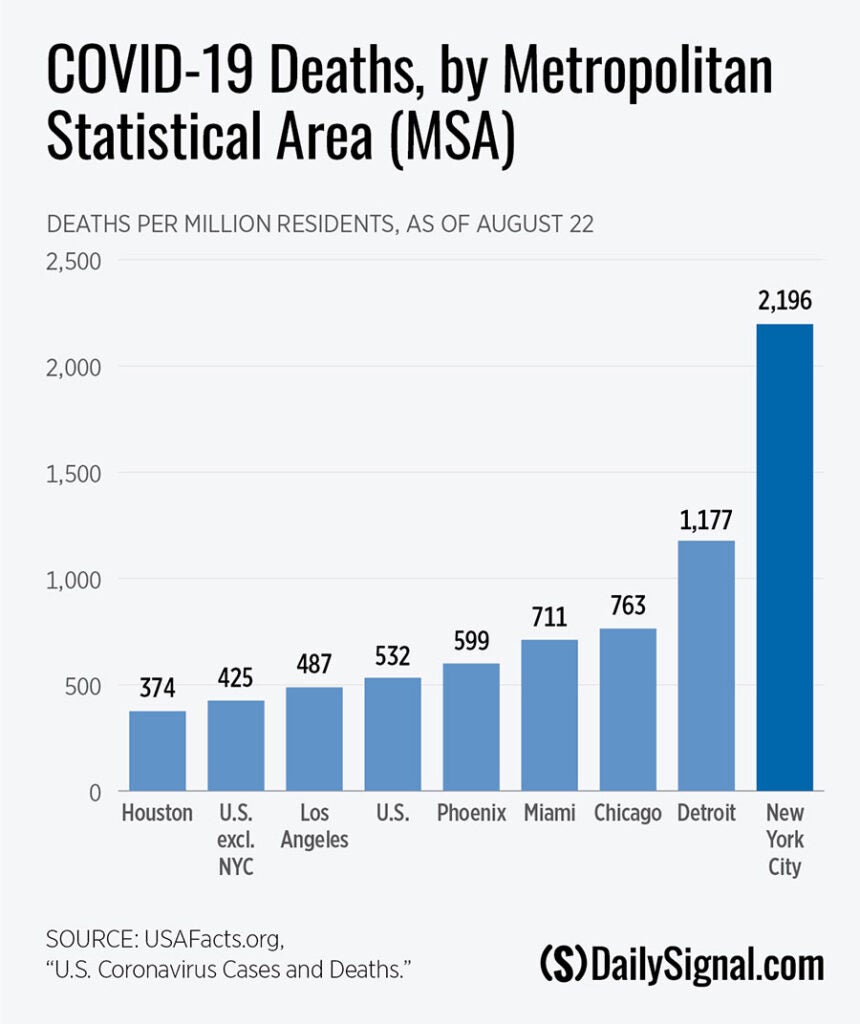
As new Heritage Foundation research shows, as of Aug. 22, the death rate of 2,196 per million residents recorded in the New York City metropolitan statistical area is almost twice that of its nearest rival, Detroit, at 1,177.
Furthermore, the gap between New York City’s COVID-19-related death rate and those of cities that have experienced more recent outbreaks is even more pronounced. The New York City metropolitan statistical area’s death rate is more than triple those of Phoenix and Miami—two cities that have recorded higher rates of infection than New York. It is four and a half times that of Los Angeles and nearly six times that of Houston.

Now that COVID-19 testing has increased dramatically and many state and local governments have relaxed stay-at-home orders, it’s even more critical to study the trends in deaths along with cases.
To make studying these trends easier, The Heritage Foundation now has two interactive COVID-19 trackers. One tracks trends in cases; the other tracks trends in deaths.
The trackers describe whether the trend of cases—or deaths—is increasing or decreasing over the prior 14 days, and provides a visual depiction of new cases—or deaths—during that time period.
These tools help put the concentrated nature of the pandemic in perspective with county-level data. They show just how difficult it can be to use only one metric to gauge whether a county—or state—is doing well. Readers are invited to explore the information in the tracker and check back frequently for updates, as well as to explore the other visual tools on Heritage’s COVID-19 resources page.


