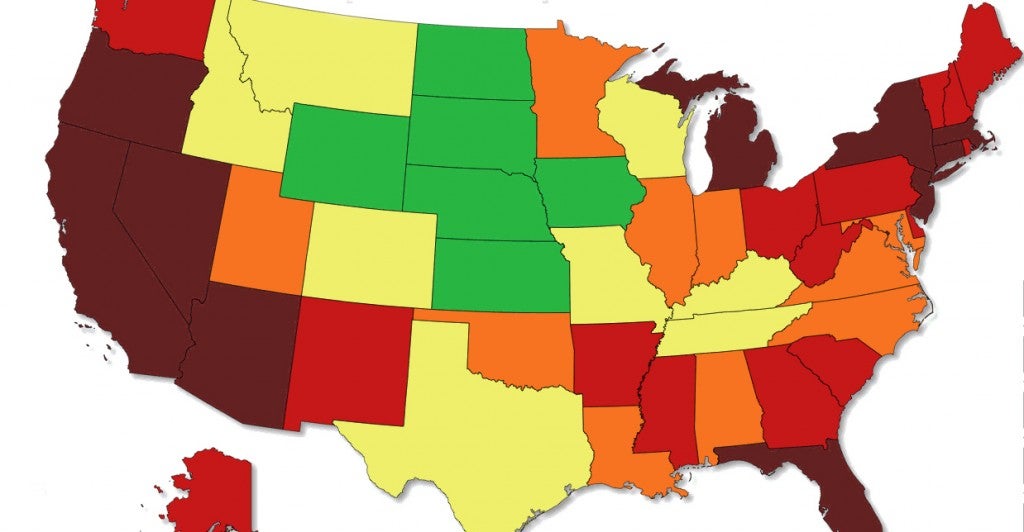
A new map—presented as a GIF—is putting unemployment rates in historical context. Courtesy of Metric Maps, the image shows how unemployment rates have changed state-by-state from 1976 to 2014.
From the economic downturn in the late 1970s and early 1980s to the oil boom that has lowered the unemployment rate in North Dakota to national lows, the evolution of joblessness ranges from the end of President Gerald Ford’s administration to President Obama’s term.
