4 Charts Every Mom With Kids Going Back to School Should See
Kelsey Lucas /
Many kids are heading back to public school this week, and so begins fall and spring semesters. You have entrusted the government to give your child a good curriculum and a teaching staff you can count on. But what happens when the school staff is equipped with a big list of employees, but not necessarily a big crop of teachers focused on your child?
Tax dollars in places you don’t know about.
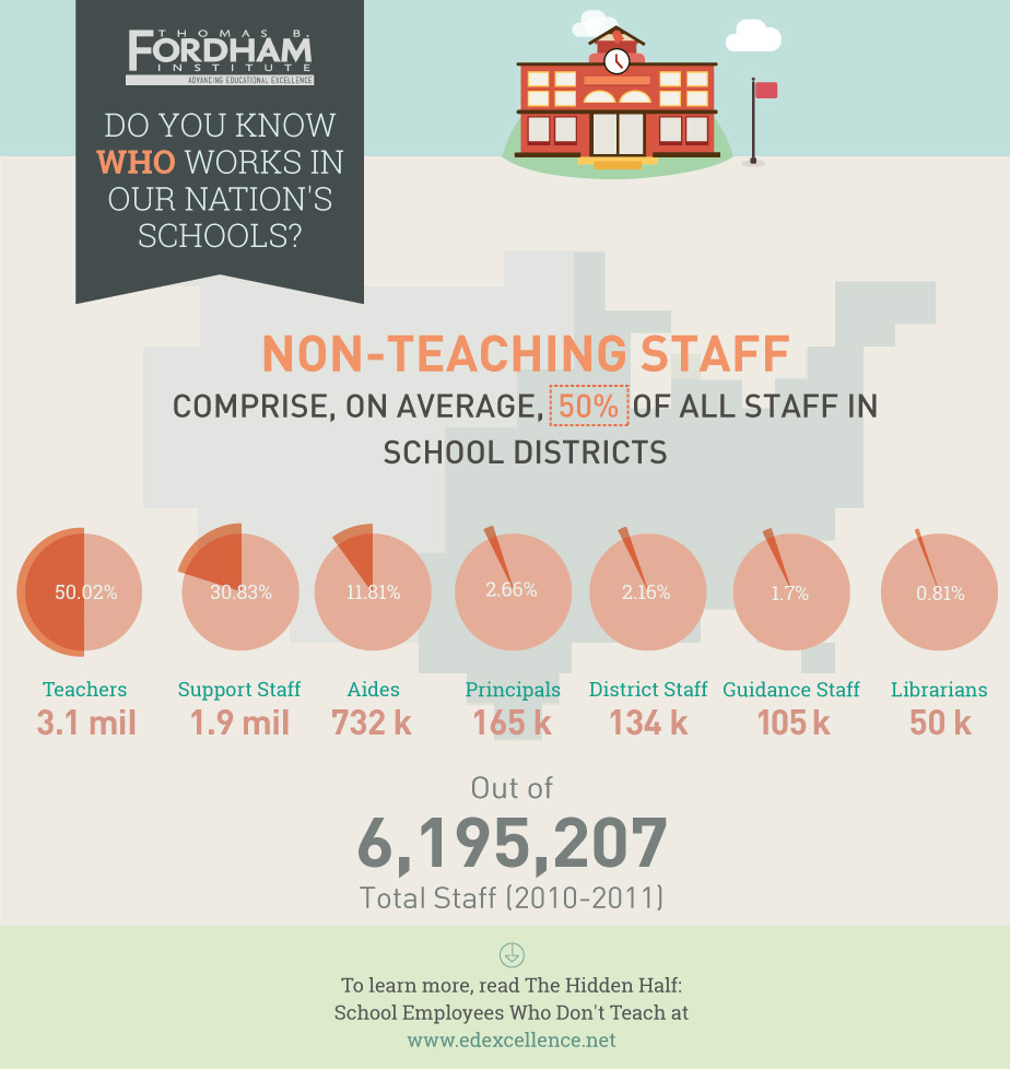
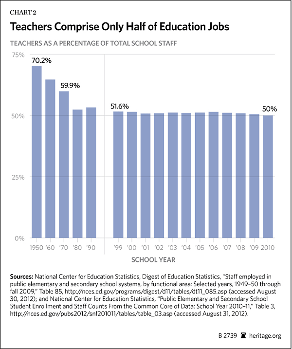
Even though the Obama Administration proposes spending $25 billion specifically to “provide support for hundreds of thousands of education jobs” in order to “keep teachers in the classroom,” research by both Heritage and The Fordham Institute reveal alarming numbers: only half of education jobs belong to teachers.
Heritage’s education policy expert Lindsey Burke says “school districts should trim bureaucracy and work on long-term reform options for better targeting taxpayer resources,” instead of putting taxpayers on the hook for more federal spending.
Check out the numbers in the four charts below.
1. The charts proving only half of education jobs are teachers:
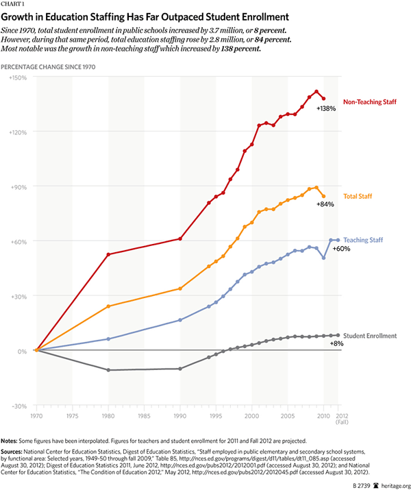
2. The chart that proves how much education staffing has outpaced student enrollment:
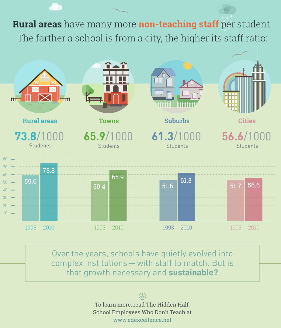
3. The chart showing the farther a school is from a city, the more non-teaching staff it has:


