A controversy continues to brew over the red cup introduced by Starbucks to kick off the holiday season: Is the new cup design in line with the Christmas spirit?
The coffee company describes the cup’s color as a simple, poppy red “that shades into a darker cranberry.”
“We have anchored the design with the classic Starbucks holiday red that is bright and exciting,” Jeffrey Fields, Starbucks vice president of design and content, said in an official statement. “The ombré creates a distinctive dimension, fluidity and weightedness.”
Each year, Starbucks unveils a new cup design for the Christmas season.
“In the past, we have told stories with our holiday cups designs,” Fields said, according to the Starbucks release. “This year we wanted to usher in the holidays with a purity of design that welcomes all of our stories.”
The absence of such traditional elements as snowflakes and ornaments has left some in the social media world blowing up over a “war on Christmas”—for what others say is a non-issue. Some note that the green and white Starbucks logo on the red background has a Christmas feel.
TRENDING ARTICLES


“Starbucks has become a place of sanctuary during the holidays,” Fields said. “We’re embracing the simplicity and the quietness of it. It’s [a] more open way to usher in the holiday.”
Here are 24 tweets about the controversy that left some threatening to boycott the coffee chain.
https://twitter.com/BrandanJR/status/663440754983968768
I'm a Christian & I'm wondering . . . what do snowflakes have to do with Jesus anyway? #MerryChristmasStarbucks #redcup
— MarcyCC (@xo__Marcy) November 8, 2015
As a Christian, I can tell you that the color of Starbucks cups have nothing to do with Jesus, the gospel, or Christianity. They are cups.
— selling too early mike (@MCastroMusic) November 9, 2015
The Starbucks #RedCup issue is 100% stupid.
People are just making up reasons to be offended.
Enjoy your drink & draw your own design!— Sarah Lynn ???? SoCraftastic (@sarahlynntea) November 10, 2015
https://twitter.com/AnthonyDelucV/status/664157730282803200
https://twitter.com/rudepundit/status/663696040281767936
Seriously #GetOverIt It's a cup folks, not a tree! Decorate it with tinsel & lights if it's such a big deal! #redcup pic.twitter.com/8beQgXJk5j
— EvCurlGurl (Evelyn) (@EvCurlGurl) November 10, 2015
https://twitter.com/JLE_JD/status/664208202171588612
https://twitter.com/Utahrd/status/664206224733306880
https://twitter.com/KayKay_Marx/status/663042742373629952
#redcup ridiculousness https://t.co/NwwHGLnx5p pic.twitter.com/0Aik396XOQ
— rachel whitehouse (@madameswanky) November 10, 2015
Just had an entertaining convo about the non-existant war on #Christmas with my fave #starbucks #baristas. #redcup
— Candace Huntly (@candacehuntly) November 10, 2015
Sorry, not boycotting…. #starbucks #redcup #Christmas pic.twitter.com/6bHfRyHmL6
— Laura Nicole (@laurabagley4) November 10, 2015
https://twitter.com/ryanmlowery/status/664166684077387776
Omg Chick-fil-A hates Christmas! Will you look at this cup!? #redcup #sarcasm #WarOnChristmas pic.twitter.com/uwIqSLozjA
— Garbage John (@JohnPhillips26) November 10, 2015
https://twitter.com/krystinak13/status/664161764544647168
https://twitter.com/MeDaSuperman/status/664159869981753344
It's what's inside that counts.#redcup #starbucks #coffee #espresso #merrychristmas #psl … https://t.co/7en53fYO9d pic.twitter.com/KHZqGmPT6Z
— Goldspot Pens (@goldspotpens) November 10, 2015
If people were only talking about destroying ISIS as much as their rage with red cups from Starbucks, we'd be getting somewhere America.
— Justen (@JustenCharters) November 10, 2015
https://twitter.com/Montel_Williams/status/663929053045522432
Has anyone actually met someone offended by the Starbucks cups?
— Drew Holcomb (@drewholcomb) November 10, 2015
if you think people are actually upset over the stupid starbucks cups, read @MZHemingway https://t.co/v7UhcuQXmE
— Katrina Trinko (@KatrinaTrinko) November 10, 2015
https://twitter.com/TPCarney/status/663803624116641792
I am a capitalist. Starbucks has the best coffee. I don't go for salvation. I go for caffeine. But I will tell the barista Merry Christmas
— Sonnie Johnson (@SonnieJohnson) November 9, 2015

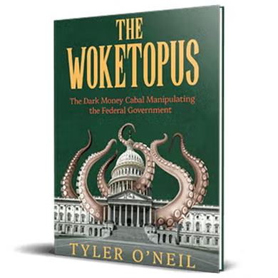
Read the first chapter of The Woketopus right now for FREE
Today, even with President Trump’s victory, leftist elites have their tentacles in every aspect of our government.
The Daily Signal’s own Tyler O’Neil exposes this leftist cabal in his new book, The Woketopus: The Dark Money Cabal Manipulating the Federal Government.
In this book, O’Neil reveals how the Left’s NGO apparatus pursues its woke agenda, maneuvering like an octopus by circumventing Congress and entrenching its interests in the federal government.
You can read the first chapter of this new book for FREE in this eBook, The Woketopus: Chapter One using the secure link below.

The Daily Signal depends on the support of readers like you.
RELATED ARTICLES


Don’t miss the