Ever since President Obama started running for president in 2007, there has been a debate about how much tax rich Americans pay and whether they should pay more.
In that ongoing debate, Paul Krugman and Matt Yglesias criticized the chart below because, according to them, it does not give a complete picture of the tax burden borne by Americans because it only includes the federal income tax.

Since the rich pay a higher share of federal income taxes than of total federal taxes, they argued we were misleading by making it look like the rich pay a higher share of taxes than they do.
We responded to them here and here.
In those responses, we showed we weren’t being misleading because we make plain the chart includes only federal income tax. Furthermore, examining the federal income tax makes sense because President Obama has long wanted to raise it on the rich.
TRENDING ARTICLES


We also agreed that it made sense to look at the total federal tax burden, in addition to federal income taxes, to offer additional context to the debate.
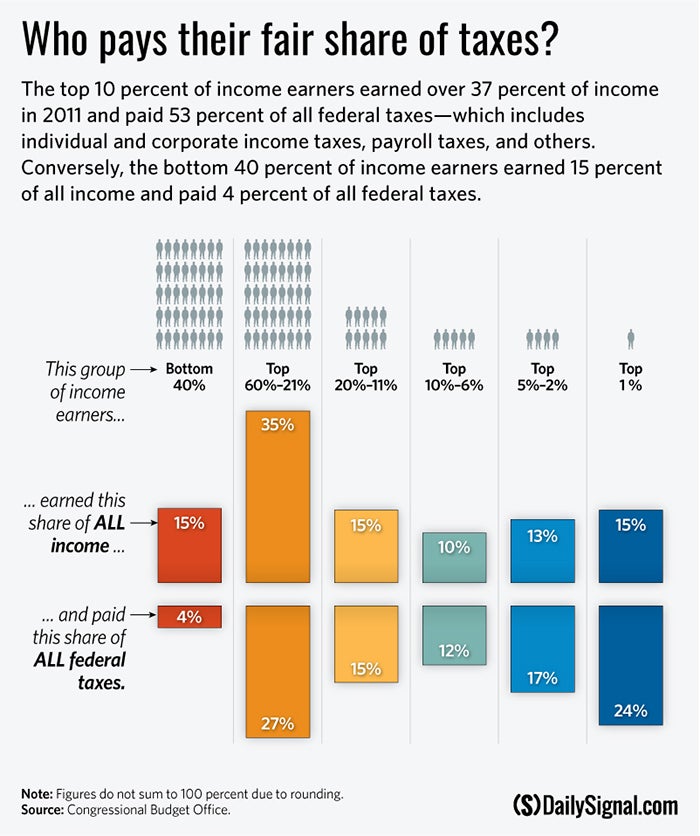
In that spirit, here is a new chart that shows the burden of all federal taxes, including individual income, corporate income, payroll, excise and other miscellaneous taxes:

It still shows the same story: Top earners pay a disproportionately large share of the federal tax burden.
The top 10 percent pays 53.3 percent of all federal taxes. When looking at just federal income taxes, they pay 68 percent of the burden.
The top 1 percent pays 24 percent of all federal taxes compared to 35 percent of all federal income taxes.
The data for total federal taxes comes from the Congressional Budget Office. The data for federal income taxes comes from the IRS. Heritage has not altered the data from either in any way, except to combine income categories in the Congressional Budget Office data.
The respective sources use different breakpoints for income categories. They also use different definitions of income. The Congressional Budget Office’s is broader because it is market income, which includes more government transfer payments than the IRS’s use of Adjusted Gross Income. Nevertheless, comparing them is still a useful way to understand who pays how much federal tax.
The top 10 percent and top 1 percent pay smaller shares of the tax burden when looking at total federal taxes than federal income taxes because the payroll tax, which accounts for more than a third of all federal tax receipts, is more evenly distributed than the income tax. But the corporate tax tempers that effect because it falls mostly (75 percent according to Congressional Budget Office) on shareholders, most of whom earn higher incomes, although not all of them.
Neither chart makes a judgment on whether those top earners pay too much or if they should pay more. The purpose of the original chart and this one is simply to give the American people facts.
Given the information in the charts, people will have differing opinions as to how the tax burden on the rich should change, or whether it should change at all. But at least they will know the starting point from which they are changing the distribution of the tax burden, instead of thinking that high earners are not paying a large share of the tax burden, as some have led them to believe in recent years.

Read the first chapter of The Woketopus right now for FREE
Today, even with President Trump’s victory, leftist elites have their tentacles in every aspect of our government.
The Daily Signal’s own Tyler O’Neil exposes this leftist cabal in his new book, The Woketopus: The Dark Money Cabal Manipulating the Federal Government.
In this book, O’Neil reveals how the Left’s NGO apparatus pursues its woke agenda, maneuvering like an octopus by circumventing Congress and entrenching its interests in the federal government.
You can read the first chapter of this new book for FREE in this eBook, The Woketopus: Chapter One using the secure link below.
TRENDING ARTICLES

The Daily Signal depends on the support of readers like you.
RELATED ARTICLES


Don’t miss the