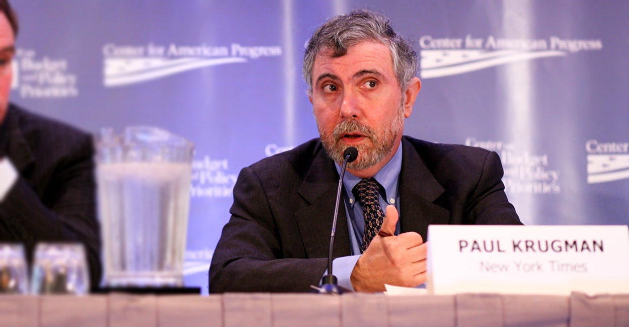
Paul Krugman has this to say about our chart below:
[T]he Heritage Foundation tells us that the top 10 percent of filers are cruelly burdened, because they pay 68 percent of income taxes, it’s hoping that you won’t notice that word “income”—other taxes, such as the payroll tax, are far less progressive. But it’s also hoping you don’t know that the top 10 percent receive almost half of all income and own 75 percent of the nation’s wealth, which makes their burden seem a lot less disproportionate.
Krugman might be surprised to learn he’s recycling an already rebutted critique. Earlier this year, Matt Yglesias of Vox made the same claim that we were somehow trying to obscure the fact that there are other taxes than the federal income tax.
Here is our response to him, which applies the same to Krugman:
TRENDING ARTICLES


Our chart looks exclusively at federal income taxes in the context of the current debate over whether the rich should pay more of that tax. Yglesias thinks that, when considering this issue, it is more appropriate to look at the progressivity of all taxes Americans pay, including federal income taxes, payroll taxes, and state and local taxes.
Just because this chart doesn’t account for those other taxes doesn’t make it misleading.
President Obama started the debate about raising the federal income tax on the rich way back when he was still a candidate for the presidency. And his support for higher income taxes on the wealthy continues today—check out his latest budget as an example. One of his arguments in favor of that policy was that the rich don’t pay enough income tax compared to lower earners.
In that context, it is highly appropriate to focus on data about the federal income tax. Before deciding if the rich should pay more of that tax, it’s only common sense to see how much they pay of it now.
Expanding the debate to include other taxes can add even more context to a complex issue. In fact, we often look at the total federal tax burden, which includes the payroll tax, corporate taxes, excise taxes, and others. Here is a good example as it pertains to President Obama’s infamous Buffett Rule.
Krugman goes a step further by saying we hope readers don’t know how much income the rich earn. Yet the income figures for each income group we cite are right there in the chart.
It seems Krugman didn’t bother to look at the chart before trying to impugn it.

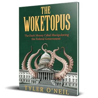
Read the first chapter of The Woketopus right now for FREE
Today, even with President Trump’s victory, leftist elites have their tentacles in every aspect of our government.
The Daily Signal’s own Tyler O’Neil exposes this leftist cabal in his new book, The Woketopus: The Dark Money Cabal Manipulating the Federal Government.
In this book, O’Neil reveals how the Left’s NGO apparatus pursues its woke agenda, maneuvering like an octopus by circumventing Congress and entrenching its interests in the federal government.
You can read the first chapter of this new book for FREE in this eBook, The Woketopus: Chapter One using the secure link below.
TRENDING ARTICLES
The Daily Signal depends on the support of readers like you.
RELATED ARTICLES


Don’t miss the