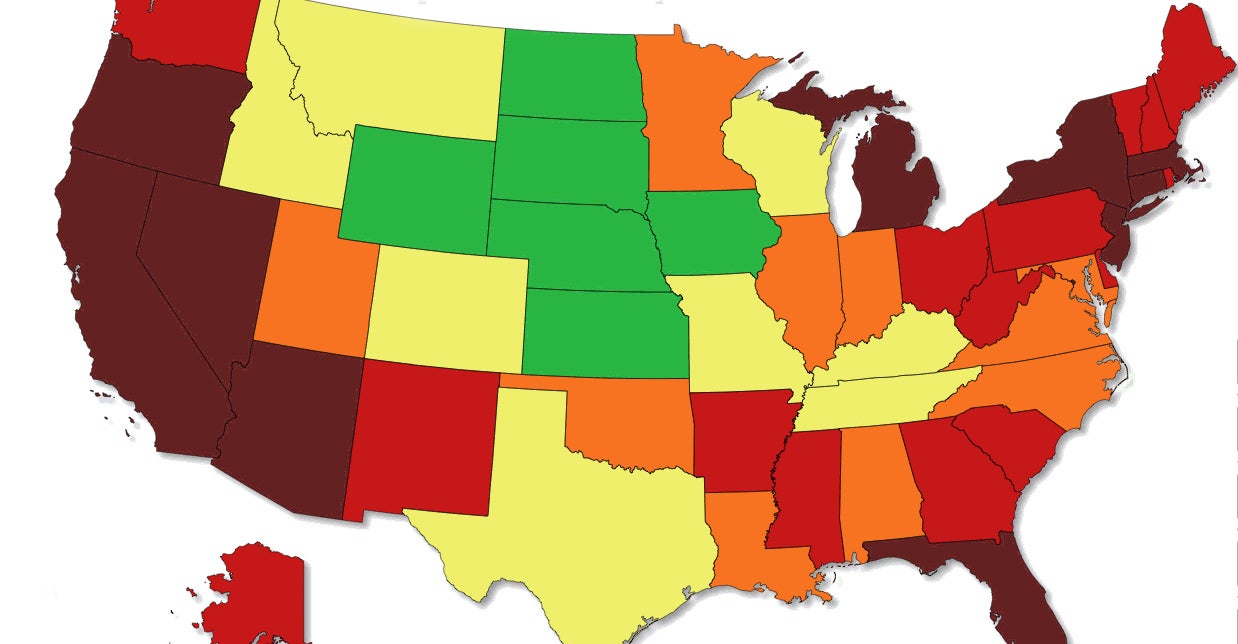

A new map—presented as a GIF—is putting unemployment rates in historical context. Courtesy of Metric Maps, the image shows how unemployment rates have changed state-by-state from 1976 to 2014.
From the economic downturn in the late 1970s and early 1980s to the oil boom that has lowered the unemployment rate in North Dakota to national lows, the evolution of joblessness ranges from the end of President Gerald Ford’s administration to President Obama’s term.


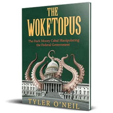
Read the first chapter of The Woketopus right now for FREE
Today, even with President Trump’s victory, leftist elites have their tentacles in every aspect of our government.
The Daily Signal’s own Tyler O’Neil exposes this leftist cabal in his new book, The Woketopus: The Dark Money Cabal Manipulating the Federal Government.
In this book, O’Neil reveals how the Left’s NGO apparatus pursues its woke agenda, maneuvering like an octopus by circumventing Congress and entrenching its interests in the federal government.
You can read the first chapter of this new book for FREE in this eBook, The Woketopus: Chapter One using the secure link below.
TRENDING ARTICLES

The Daily Signal depends on the support of readers like you.
RELATED ARTICLES


Don’t miss the