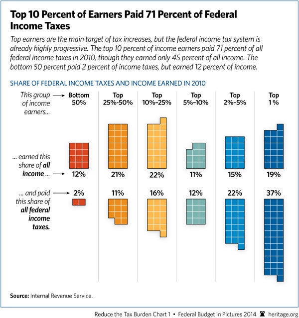
Matt Yglesias, now with Vox, finds this chart of ours misleading:
He admits that the data is correct and that what it shows—that the federal income tax is highly progressive—is also correct.
So what’s the problem?
Our chart looks exclusively at federal income taxes in the context of the current debate over whether the rich should pay more of that tax. Yglesias thinks that, when considering this issue, it is more appropriate to look at the progressivity of all taxes Americans pay, including federal income taxes, payroll taxes, and state and local taxes.
Just because this chart doesn’t account for those other taxes doesn’t make it misleading.
President Obama started the debate about raising the federal income tax on the rich way back when he was still a candidate for the presidency. And his support for higher income taxes on the wealthy continues today—check out his latest budget as an example. One of his arguments in favor of that policy was that the rich don’t pay enough income tax compared to lower earners.
In that context, it is highly appropriate to focus on data about the federal income tax. Before deciding if the rich should pay more of that tax, its only common sense to see how much they pay of it now.
Expanding the debate to include other taxes can add even more context to a complex issue. In fact, we often look at the total federal tax burden, which includes the payroll tax, corporate taxes, excise taxes, and others. Here is a good example as it pertains to President Obama’s infamous Buffett Rule.
It would’ve been more constructive if Ygelsias had offered the data he did in his post as a way to expand this sometimes contentious debate.
In that case, we would’ve been glad to engage further. And we wouldn’t have called him misleading.


One Reply to “Response to Matt Yglesias: Heritage Tax Chart Isn’t Misleading”