When House Minority Leader Nancy Pelosi’s (D–CA) staff released a chart in May that attempted to illustrate how much past Presidents increased the national debt, it collided with a meticulous critique from Politifact that in turn led to a revised chart. The Washington Post’s Glenn Kessler weighed in as the original chart resurfaced recently, reporting on its methodological faults and misleading presentation. Even the revised version makes President Obama’s debt accrual appear minor compared to that of past Presidents.
The facts show, however, that the Obama Administration is well on its way to accumulate an unprecedented mountain of debt. The chart below provides a more accurate comparison of President Obama’s debt record to that of his predecessors.
This chart employs data for debt held by the public, as opposed to gross debt. Debt held by the public reflects how much the U.S. is borrowing from non-government sources, including global capital markets, while gross debt includes debt held by government accounts such as the Social Security Trust Fund.
Debt and changes in debt can be measured in various ways. This chart tracks the change in debt as a share of the economy—that is, gross domestic product (GDP)—instead of as a raw percentage change. As Kessler points out, “GDP is the broadest measure of the national economy and directly indicates the nation’s ability to service its debts.” In this case, it allows for an apples-to-apples comparison of different Administrations.
The length of time a President served also matters when assigning debt and making comparisons. This chart measures debt increases by Presidential term—i.e., four-year increments. President Reagan saw a 14.8 percent increase in the debt as a share of GDP over his eight years: 10.6 percent in his first term and 4.2 percent in his second. President Clinton enjoyed a nearly 17 percent decrease over the same number of years, first dipping 3.4 percent and then 13.4 percent in his second term when the economy was booming. George H. W. Bush’s record stands at 8.7 percent over four years.
As a percentage of GDP, debt increased by 4.4 percent during President George W. Bush’s first term and by nearly 17 percent in his second. At first glance, he and President Obama appear neck-and-neck at 21 percent and 23 percent, respectively. But there is one catch: Obama will have served for half the time. By 2013, President Obama will have increased debt by 23 percent after just four years—more than President Bush’s total eight-year increase of 21 percent and well more than either of the two Bush terms.
The future doesn’t look any brighter if the Obama Administration’s tax-and-spend policies remain the norm. Under these same policies, a second Obama term would see an increase of another 10 percent by 2017 for a two-term total of nearly 34 percent.
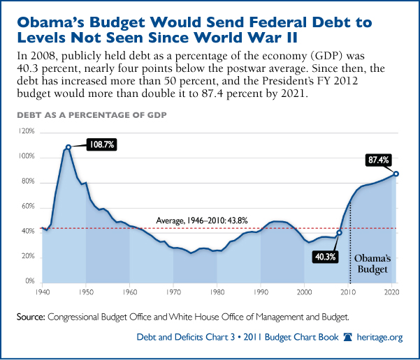
Another important measure is the ratio of total debt to GDP, which indicates both the nation’s capacity for handling debt and whether the current fiscal path is sustainable. According to the above Budget Chart Book chart, debt is slated to reach 87 percent of GDP by 2021. The most recent Congressional Budget Office long-term budget outlook accelerates that date to 2017.
President Obama has consistently sidestepped proposing any serious solutions to this grave problem despite several big opportunities, such as his fiscal year 2012 budget and recent deficit reduction proposal. Clearly, such a practice is unsustainable.


55 Replies to “In Pictures: Debt by President? Obama Leads the Pack”